UI/UX: 6 Lessons from a Knowledge Sharing
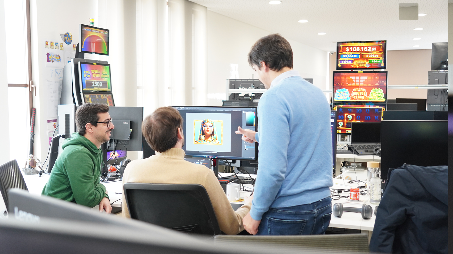
Circumstances change routines, but they don't break connections or the desire to learn, and Fabamaq's Knowledge Sharing sessions prove just that. During this period of confinement, we've had the pleasure of learning in various sessions, and the latest one focused on the fundamental principles of UI/UX Design. Sharing knowledge with the company in this Knowledge Sharing session was Fátima Elias, a web designer at Fabamaq for over 2 years, who provided us with 6 suggestions or best practices related to the topic:
1. Know the user
When we talk about experience, understand that it's the relationship between a user and a product, meaning the user is the primary factor in a digital experience. It's important to observe and research the user and understand who we're creating the product for. This involves knowing their needs, demands, and frustrations. The more realistic our perception of this user and the more the product is tailored to them, the greater its success will be.
2. Simple, Objective, Consistent
Products should provide simple, objective, and consistent experiences. By simplicity, we mean that the product should be easy to understand and use. Ease of use (usability) and maintaining visual coherence in the experience bring feelings of pleasure, control, and credibility to users.
Overloading information, mixing strong tones, or offering too many action options are examples that can delay a product's effectiveness. If we choose this path, users will be required to apply significant cognitive effort, which will likely lead to losing their loyalty.
3. Embrace "white space" fearlessly
Using white space in design composition is like using silence in a musical composition. Without proportional use of silence, the music isn't structured. Without white space, the design composition isn't structured and becomes difficult to consume.
Applying this methodology significantly improves the user experience. There's better content comprehension, increased focus or attention in usage, and a higher interaction rate.
4. Establish visual hierarchy
All cultures read from top to bottom and mostly from left to right. As designers, we have a duty to make decisions regarding content prioritization, colour, and contrast. The goal is to properly emphasize the most important elements of each composition, establishing a visual path that guides the user's perception objectively.
5. Design quality affects credibility
The product needs to be functional, reliable, and easy to use, but it lacks the cherry on top: appearance and quality. This duo of elements makes users come back to our product, use it repeatedly, and recommend it to others.
When creating a user-centred product, we must consider creating a connection between the user and the product. In this connection, we must pay attention to the product's aesthetics, creating a sense of pleasure in its use. Have you ever bought a product (whatever it may be) that wasn't "pretty" or aesthetically pleasing to you? The likely answer is "no," and part of the reason relates to what we just mentioned.
6. Prototype, prototype, prototype!
A prototype aims to facilitate the understanding of the requirements of a digital product. At the same time, through it, we can present concepts and functionalities of the product in a simple way. By prototyping, we can propose an appropriate solution to the customer's problem, increasing their perception of value.
Additionally, we allow the user to have an agile first experience to analyse how the resources are distributed, how the layout is organized, and how other elements that impact the usability of the product are assembled. The more reliable the prototype, the easier it will be for customers to understand the products. With more realistic prototypes, teams also gain because they can better adjust their work based on customer feedback.
Knowledge Sharings have been part of Fabamaq's culture for several years. These moments of knowledge sharing among Gamers have themed and open enrolment. There are sessions dedicated to topics close to the casino games we develop, but others where we talk about other topics such as taxes, diversity, time management, or Street Fighter kicks, for example. To learn more about our culture, click here.


